NEWS
User Experience Design for an Award-Winning Music Company
Crystal clear representation.
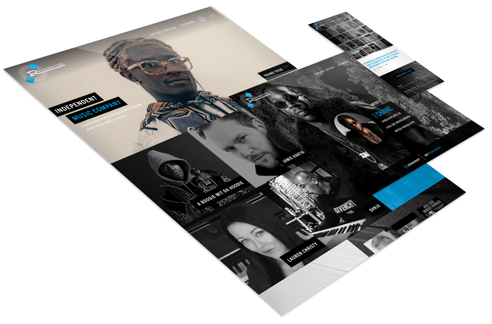
Independent music company Reservoir Media was looking to elevate their website’s design while clarifying the flow and hierarchy. When you have a lot of content, info, offerings, and represent a lot of songwriters and music catalogs, your website will inevitably have a lot of pages. This can create multiple challenges in terms of user experience. Their current site was missing the mark in terms of navigation and directing the user to the information they ultimately came there to find. The goal was to make it clear who Reservoir Media is, who/what they represent, and how to correctly connect with the right person depending on the inquiry. Primarily positioned as B2B, we approached the site with the goal of translating some of Reservoir Media’s newer visual styles into a high-end, high-functioning, carefully categorized resource for both artists and licensors alike.
A streamlined approach.
As an award-winning company and a leader in their field Reservoir’s client base included music supervisors looking to license music for film, tv, and advertising opportunities, as well as songwriters, managers, publishers, and labels looking to partner their music with one of the artists. The first step was to focus on strategy and value proposition, having already established themselves in the industry and previously preparing a desired sitemap/outline, this process was not as in-depth as it would sometimes be, and the client was eager to move quickly into the design phases. Two of our top designers were tasked with each preparing a homepage layout with an emphasis on simplified overarching navigation.
Channeling the flow.
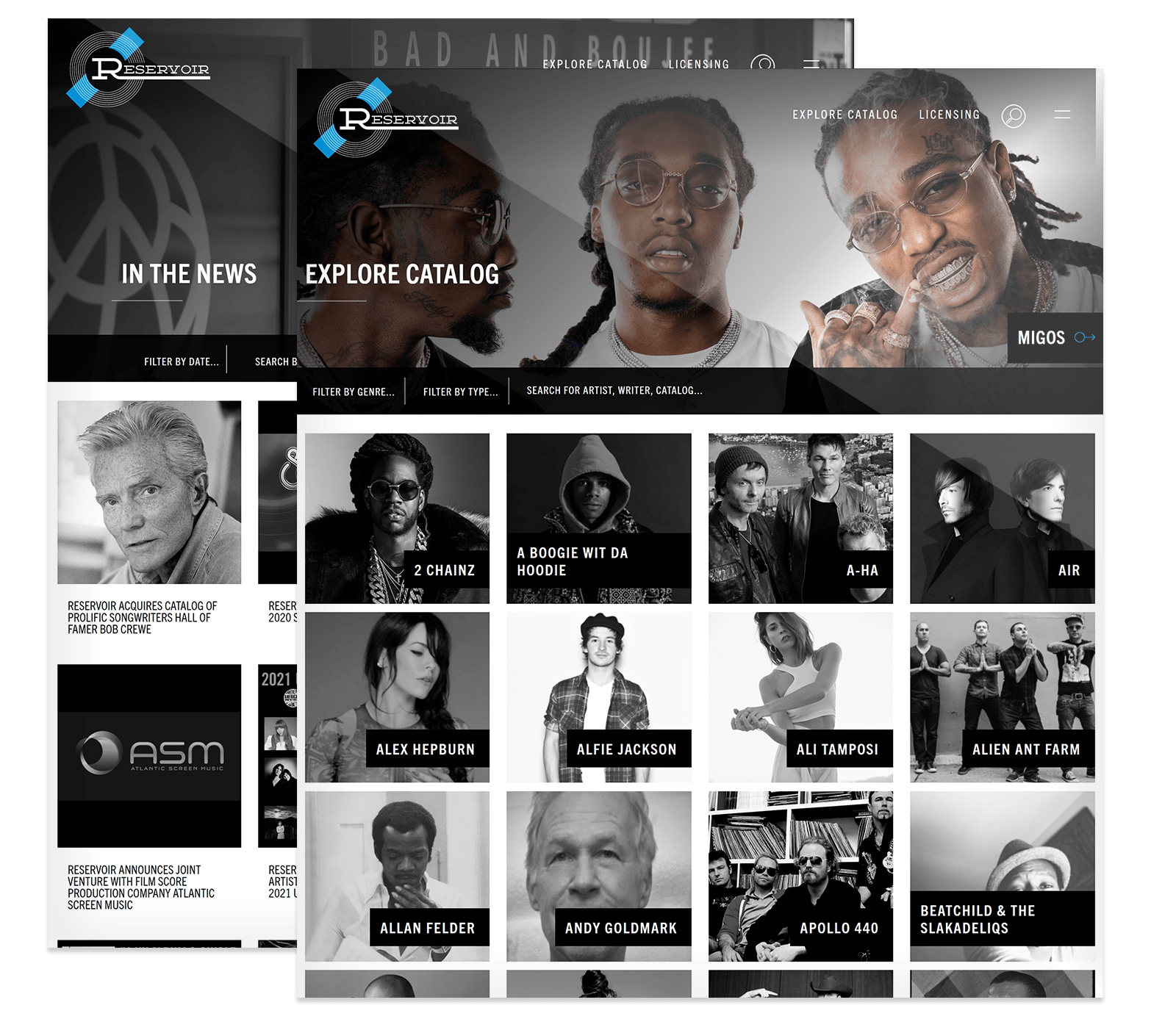
Each of the presented solutions offered clean visuals utilizing some of the great imagery and big-name artists that Reservoir represented. Design-wise we had a head start as their recent branding efforts utilized large text, strong block visual elements, and a dynamic blue accent color that played off of their prominent black and white motif. The navigation in the chosen concept strategically used a hamburger menu for less-important interior pages allowing users to quickly be drawn towards just three main sections: the catalog, licensing information, and a search function. The secondary (hamburger) menu if clicked offered a blue overlay with a large vertical menu and social media links, furthering the clarity in terms of user-flow.
Filtering design into functionality.
One of the more challenging processes in a design and development project is the transition between the two. Having quickly progressed through the visual layouts of the site – these were still in a mostly static format. Now approved for development, the working files along with a lengthy list of notes were packaged up and handed off to the dev team for the build. The site relied heavily on filtering techniques on both the catalog and news pages in order to include a lot of content in a singular space. To aid in server requests and site speed, dynamic infinity loading was used to allow ever expanding-pages of artists, images, and information.
Feeling the flow.
The design opened the door for a lot of creative interactions and animations. A pulsating logo treatment brought life to the navigation section and represented the music industry, flowing liquid-like css color overlay hover animations on black and white images added a dynamic element of interactivity. The licensing page’s contact form made it easy for prospective clients to reach out while also getting a look at recently featured placements of licensed content. The about page told a clear story of Reservoir’s history. A customized Spotify player can be found at the footer of each page providing visitors an audial sample of Reservoir’s current playlist. Although each of these elements were included in the static layouts, there was a significant disparity in aesthetics when seeing it all as a working website.
Drink it in.
With the site built, beautiful, and functioning there was still a matter of migrating the content from the old site to the new. The WordPress CMS was set up to make this easy, and the client’s team took it from there. This can be a lengthy process and was perhaps a bit more time-consuming than the client thought it would be, so when starting any project with a lot of content needing carried-over, this is something that should be considered to be included in the scope if you do not have an internal team ready to go. Once launched, the new site was now a major upgrade in terms of both the look and structure, the two main key points set out to accomplish.
Watching the design and development team work together when transitioning from static to functioning was very impressive. The client when viewing live in-browser was almost seeing a new product which then opened the door for some additional unforeseen added functionality which the team worked through with the client. When the content was all migrated over it was clear just how much of an improvement this site really was.
Read Bio CONNECT W/ Jason Jason Solak Senior Production Manager
WE’VE BEEN BUSY
check out these other recent projects
