Website Design For Healthcare
Neoenta
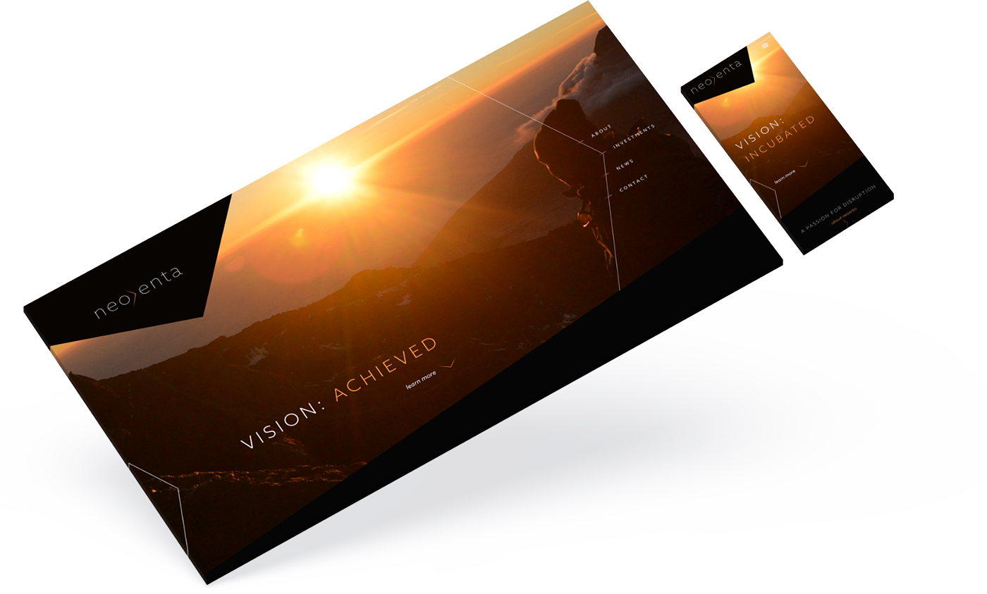
Bringing a spectrum of vision into focus
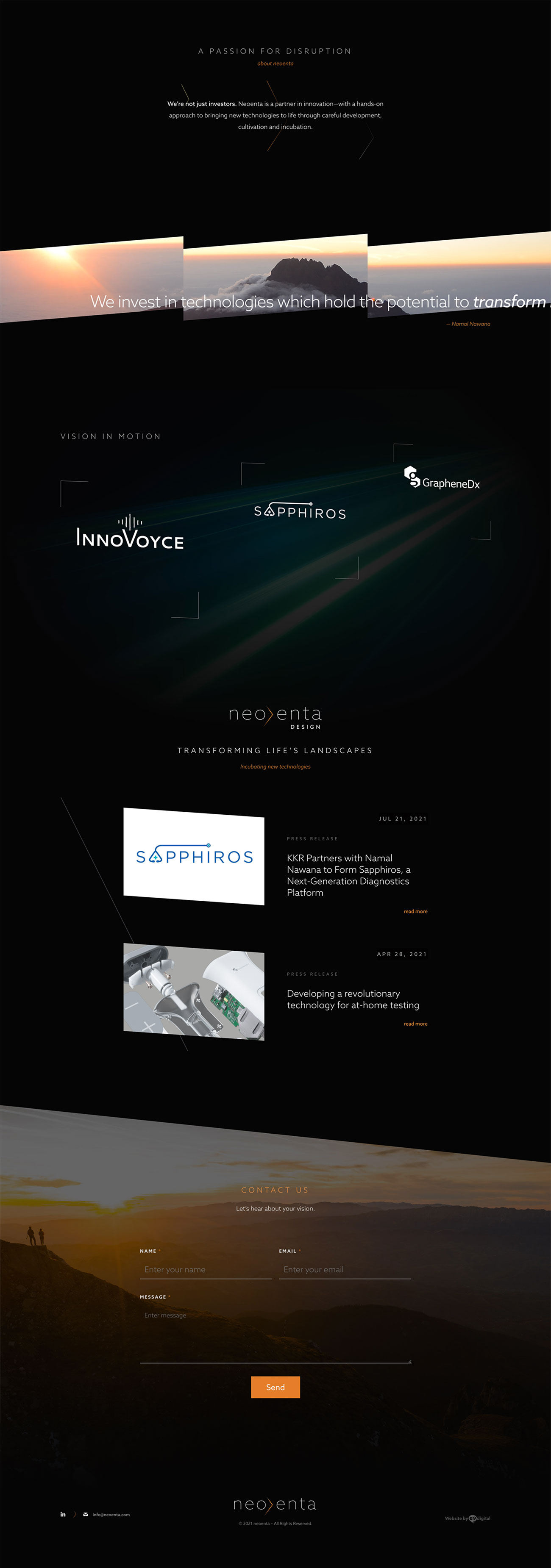
Founded by global business leader, Namal Nawana, Neoenta’s focus is to invest in medical technologies with the potential to transform healthcare by developing and licensing their intellectual property assets and cultivating early-stage technological innovations prior to launch. With a creative mind and influencer like Namal, e9’s challenge was to allow the site to be more of a portal—offering a glimpse of all of his intellectual properties rather than an overload of content.
Going behind the vision
A comprehensive discussion
With the brand being an actual person, Namal Nawana, our standard client kickoff process became more of an in-depth interview.
Crystalizing his vision
Aside from mining for the right brand data, it became more about being aligned with our client’s views of his public perception.
Creative that connects
To ensure an accurate representation of our client, we developed a creative brief with the established brand guidelines and hierarchy of communication.
Bringing the brand to life
Logo
To elevate the brand we used a thin serif font with a fiery orange gradient divider to evoke a visionary feel.
![]()
Colors
The deep black and warm gray tones add emotion to the imagery while allowing the white and amber orange colors to pop.
Fonts
We chose a sans-serif font, to tie into the logo and keep with the clean, concise look.

KEY MESSAGING

Visualizing passion


Visualizing Passion
Integrated imagery that connects to client on a personal level.


Mountainous range symbolizing magnificent discovery & innovation.
Coming Together
Responsive design and development for tablets and phones
Deployment of the WordPress CMS built for easy content and image editing
Fading animations with parallax scrolling and transitional color scheme
Preparing for the reveal
After the site is fully approved, we head into the development phase which includes a comprehensive Q&A along with beta testing.
“Tying in the imagery, new logo, and animation of the site allowed our design team to stretch our creative wings and bring a vision to life.” Tim Kirchoff, Lead Designer & Developer | e9digital
WE’VE BEEN BUSY
check out these other recent projects