OUR WORK
Rebranding?
Don’t do a re-do before talking to us.
Success of an upgrade doesn’t just come from looking outside the box, but taking an honest look within. Conrad Strabone (right after the first sip of red wine, post launch)
2008: New York Flash
We launched as a small studio in 2008, which doesn’t seem all that long ago, but in “digital years” it feels like a different era (which it actually was). Content management systems (CMS), although advancing, were still in their early years and not widely used – especially for small business websites. Hardcoded HTML brochure websites were standard, while Flash was widely used, and key, in providing users an interactive experience.

Nowadays, clients are at times as vested in the back-end functioning of the site (CMS, SEO, load speed, etc..) as they are the front-end, but back then that just wasn’t the case. Limitations, however, do not hinder creativity. In fact, you could argue that it oftentimes creates an even greater need for it. By focusing on the utilization of: current tech, solid design principles, modern trends, and clever techniques—the foundation of the e9digital brand was taking shape. While the digital toolkit has changed over the years, those values and high-standards have not.

Love behind the logo
The idea behind the e9 logo literally came to Conrad in a dream. A design that centered around balance through the repetition of shapes. AKA, the palindrome—a word that reads the same way backwards as forwards. e meets 9. Of course taking our future rebranding into account, adaptability was also a vital component. The logo design needed to stand the test of time, and continue to grow as the e9 brand evolved. Cases in point.
2011: Digital Crossroads
A lot can happen in what may feel like a few short years, and when growing a tech-centric business with long-term goals in mind—timely decisions must be made. Advancing CMS technology was having a greater palpable impact on the industry. Not only was it now more viable, it was on the path towards becoming standard. Always aspiring to be on the forefront of new technologies, e9digital did their homework by consulting developers, examining the platforms, and weighing the options. PHP, the scripting language at the core of familiar platforms such as Joomla!, Drupal, and WordPress had some setbacks, and major questions at the time. Ambition has always been another core principle of the e9 brand, so the decision was made to create a proprietary in-house CMS. This offered the best of both worlds by avoiding the shortfalls and questionability of the competing open-source options, but still offering clients the benefits of content management. Ruby on Rails, a language still used today for sites such as Airbnb, GitHub, Hulu, and Shopify, was utilized and resulted in the next step of e9’s evolution.
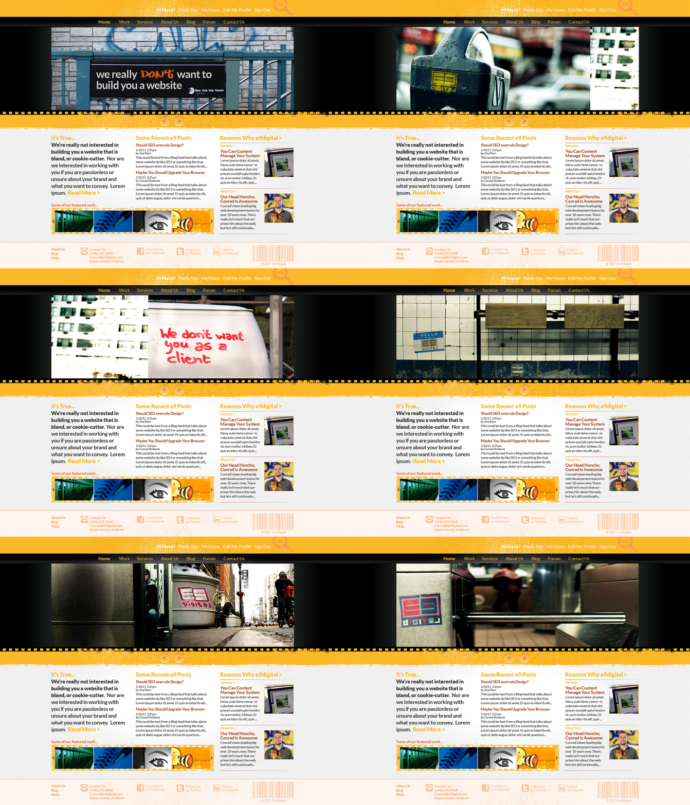
This second iteration of the e9digital website now showcased new functionality including dynamic content controlled by a back-end portal, and was a big step forward on the front-end having better navigation, richer content, and a new look. We updated our logo while keeping its core elements intact, and set a bolder tone visually and verbally. Our effervescent NYer personality was now backed up with custom photography, updated copywriting, and the color palette introduced vibrant canary yellow to contrast against the black and white backgrounds.
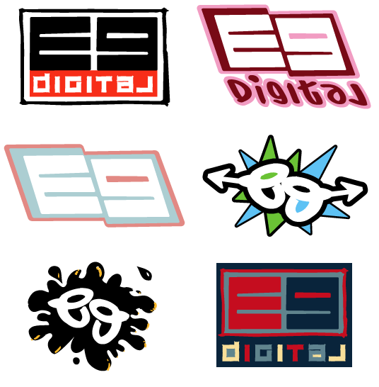
2011: Graffiti Styled Logo
When updating the website and branding, the logo evolved to match certain styles and elements. In order to have several versions used on the site they were adjusted to match a NYC graffiti look by adding colors and spraypaint elements, while still keeping the original palindromic concept.
2012: e9 Enters the Modern Age
Things come in waves, and while still riding that of the new tech in place along with an expanding client base—e9 was transitioning from a small firm into a more established boutique agency. To quickly and fully realize this more distinguished identity, it was decided to refine the previous iteration of the site by converting it into a scrolling one-pager with anchor links. Mobile browsing was becoming much more prominent, and in tandem, users were more accustomed to this scrolling experience.
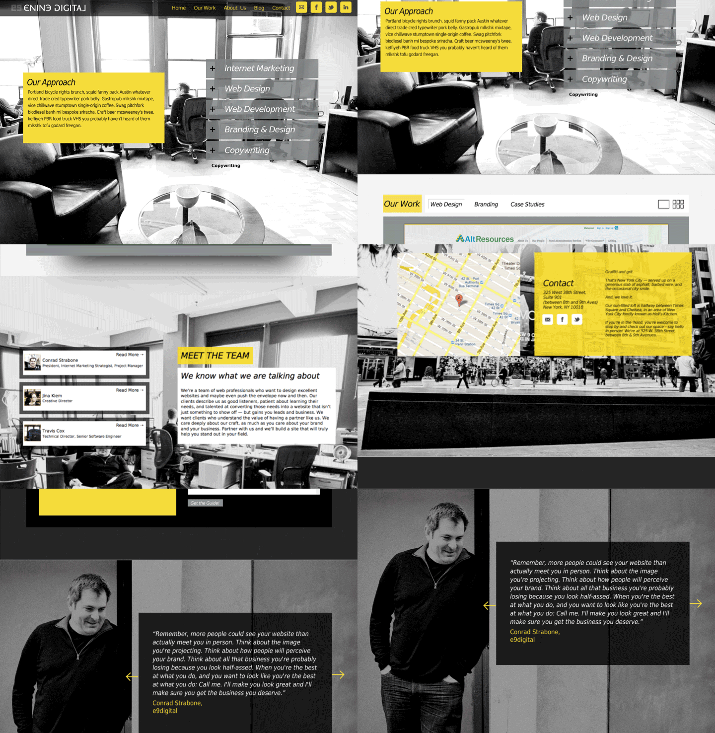
The edgy-attitude was still kept but was cleaned up by eliminating the blocky layout, and distressed look that was becoming dated due in part to the increasingly clean and simple digital trends being driven by app developers. The logo was updated again and accompanied with a complimentary font treatment that cleverly echoed the reflective elements of the logo.

2012: Cleaned up logo
When we made the site cleaner and lost some of the distressed textures, we adapted the logo to match. We also reintroduced the type treatment that further reflected the mirrored properties that had become core to the e9 logo since its inception.
2014: A Fresh Coat of Coding
Timing is everything, and with PHP7 not having to adhere to backward-compatibility, it really was a fresh start not only for e9, but many other aspects of the industry. With major updates, come major opportunities, and in e9 fashion we worked diligently to understand those opportunities.
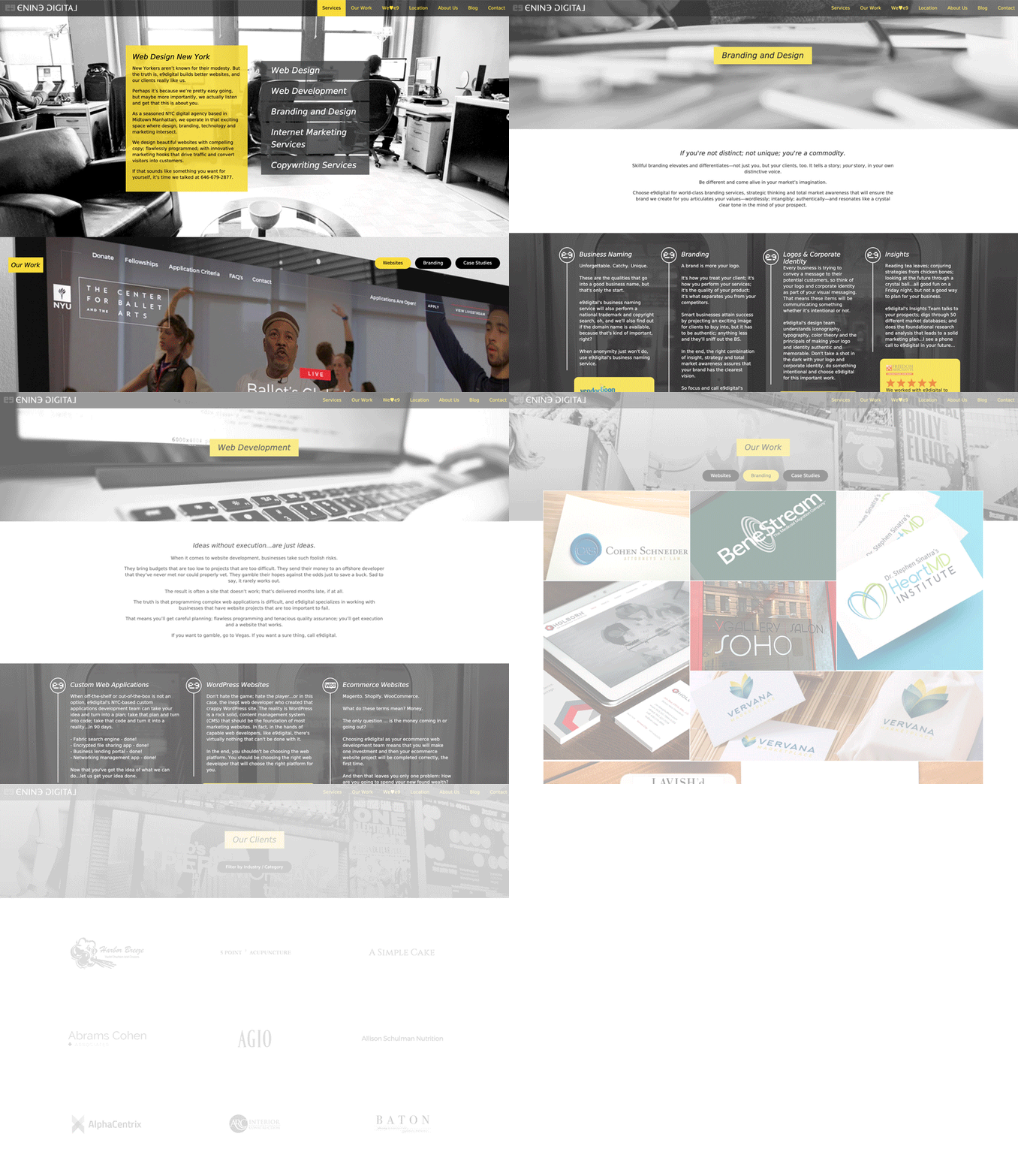
Search Engine Optimization (SEO), although always relevant in the industry, was now a household term. Having now successfully transitioned to the WordPress platform the door was open to put a greater focus on adhering to SEO best practices. That meant adding interior pages to the site, while cleaning up and enhancing metadata. Next up was device responsiveness. 2015 was a major milestone and is sometimes referred to as the Year of Mobile – the point at which Google mobile searches overtook desktop for the first time.
Impressively, our site that was originally built as a one-pager on our own proprietary CMS, was now a fully-functional, SEO-friendly, mobile-responsive WordPress site.
2020: Full Contact Disruption via Rebranding
Having the site up-to-date tech-wise gave e9 an opportunity to continue to focus on, and prioritize clients for a few years–that’s exactly what we did. That’s not to say that we didn’t continue to grow the site, which we did via added sections, blog posts, portfolio galleries, a case-study subdomain, and continued SEO. There were some discussions in 2018-2019 about redoing it from the ground up, but we knew that with the significantly increased complexity of the site, this time it would be a much greater undertaking. However, knowing that the current site was ultimately an evolving patchwork, albeit a successful one, it really was time to hit the refresh button. In this sense, we can relate to business owners who find themselves in a similar situation: they got a new site years back, they kept up with the times as best they could, it’s still serving its purpose. Though, if they ask themselves the question “Isn’t it good enough?” The answer is “no, probably not.” And it’s when they come to that realization–that our paths cross. So to practice what we preach, we got to work.
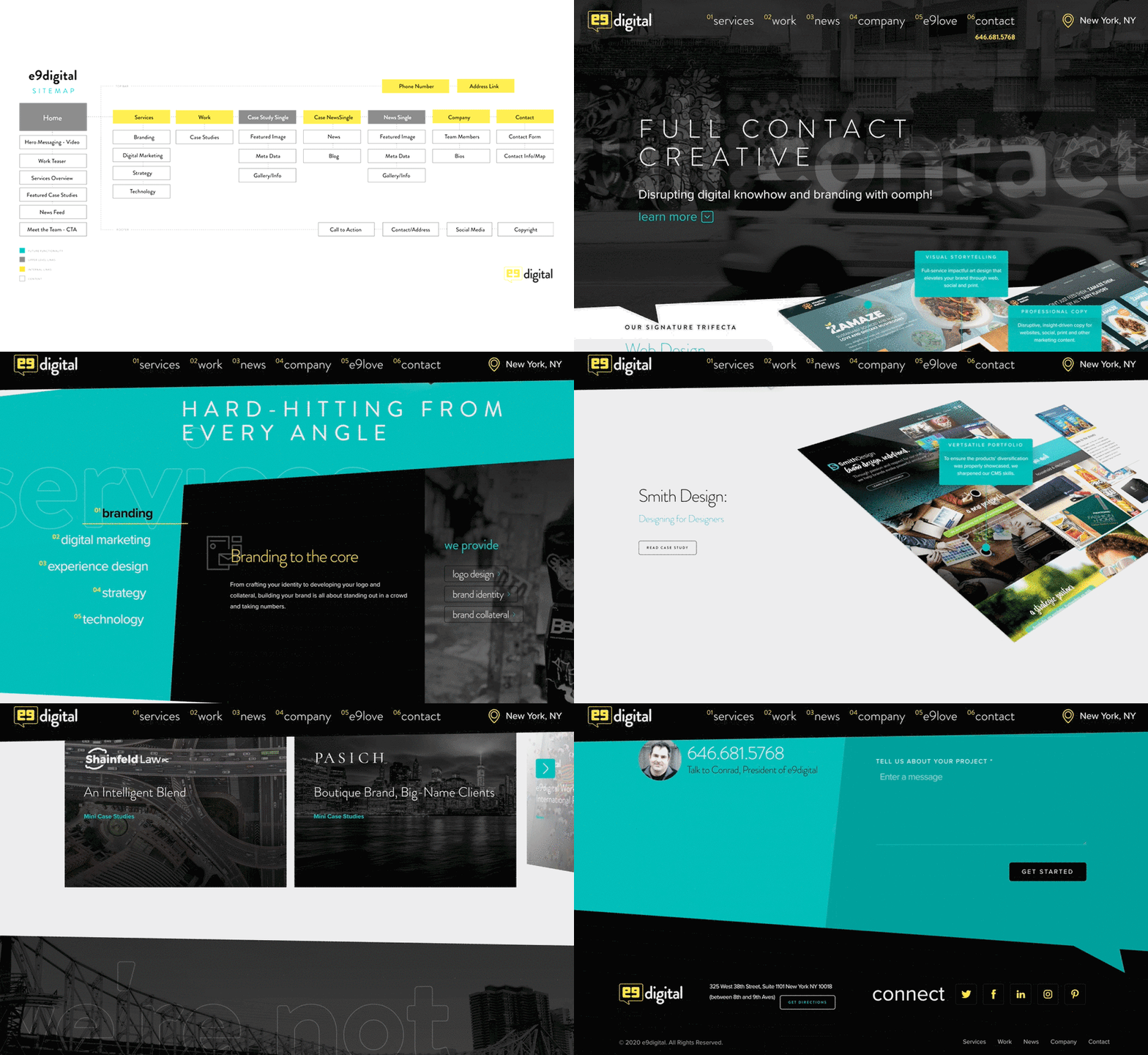
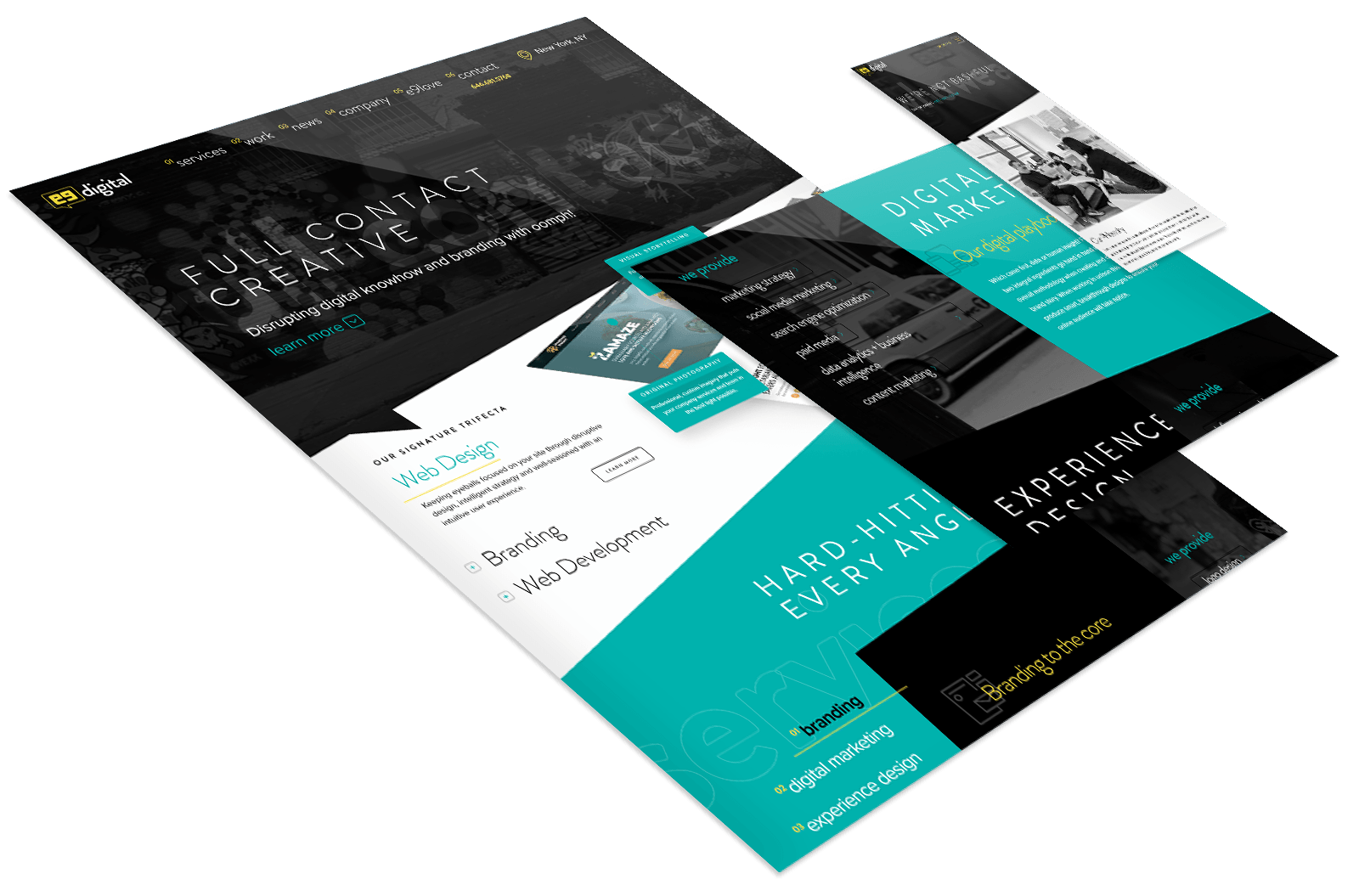
We started by reorganizing the navigation, and informational structure. Once a sitemap was solidified, we began with the design. The essence of e9 has never changed, so we continued along the same path in terms of tone, photography, and messaging. The back-end was created from the bottom up, with carefully thought out structuring, keyword research, metadata organization, and other SEO techniques in full force. The design brought in an additional accent color, this time cyan, which contrasts the black just like the yellow (now we just need magenta to round out the CMYK gamut). The logo received another update, as is tradition, and we added micro-animations, background videos, and hover links to significantly increase user interactivity while creating a circle of engagement that allows visitors to find what they need, and then some.

Re-refining the logo
Inspired by social trends, our logo’s modern makeover syncs well with our site iconography
Looking Back
Sure we updated, migrated, rethought and redesigned, but at the end of the day we stood true to our core branding elements. With us it’s not about scrapping it and starting over, but beginning the next chapter of the brand journey.
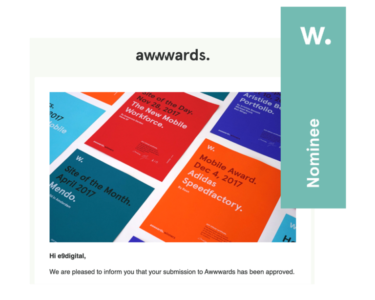
Of course, we’ve had our share of missteps, but they’ve only made us stronger on the front and back-end. And hey, we must be doing something right if our latest e9 web-iteration was nominated for “Site of the Day” by the panel of specialists at Awwwards—an organization dedicated to recognizing the talent, creativity, and innovation from leading digital agencies around the world. Definitely a nice ice breaker with clients. 🙂
All that hard work paid off with a well-deserved nomination! Nice work team!
“A rebranded frontend becomes a billboard for our innovative back-end upgrades.”
Read Bio CONNECT W/ Conrad Conrad Strabone Managing Partner | President
