Your website is more than just a place potential customers go to get information about you or your services; it’s an opportunity to differentiate yourself from others in your industry. To stand out from your competitors in a way that convinces your potential clientele that you, or your service, is in some way better or more aligned to their needs. It’s a big world, and chances are, you and your competitors have more in common than not. It might be frustrating for you, but I guarantee it’s more frustrating for a potential client looking to choose. Make their choice easier: differentiate yourself from your competitors and make a lasting positive first impression.
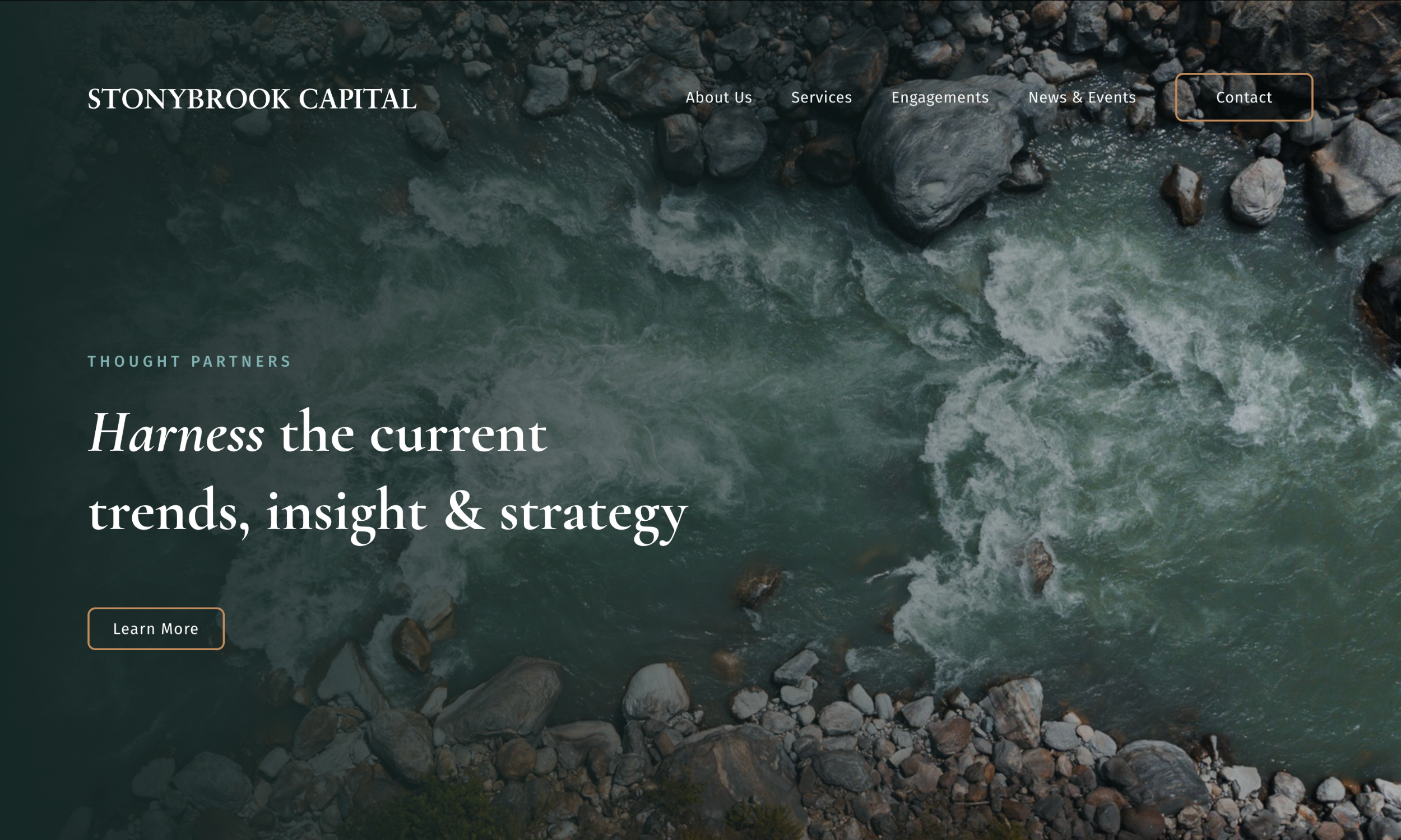
Take, for instance, our client Stonybrook Capital. As an insurance investment advisement company, they are in one of those industries where everyone kind of looks the same online. Heavy copy, bland colors, or pictures of tall buildings. Stonybrook offers similar services to their competitors, but they are younger in their industry, have a smaller team, and are able to be agile in their operations. To develop a unique online identity for Stonybrook, e9 began by identifying and understanding these differences and then strategically applied them in both overt and subtle measures throughout the website.
Look Different:
Inspired by their name and the steadfast, confident nature of their team, e9’s designers departed from the stereotypical visual identity of other insurance advisors to set Stonybrook Capital apart. The name “Stonybrook” lends itself to the idea of a babbling brook in the woods, which visually evokes a calm, peaceful place.
Say it Smarter:
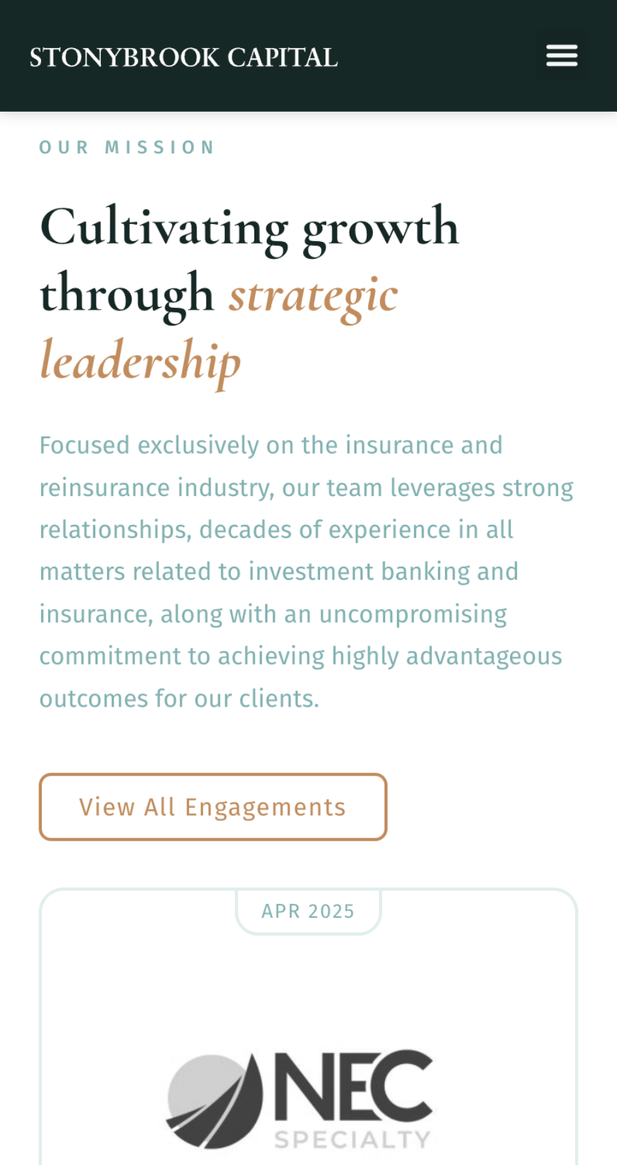
Another characteristic of Stonybrook’s competitors is dense content. Sometimes, there is no way to avoid having a lot of content on a website, but it needs to be as concise as possible, and arranged in a way that promotes a natural reading flow. Your potential customers do not have the time to read paragraphs of copy on your website. Say it quicker, say it smarter, and encourage action. By implementing this strategy for Stonybrook, their website instantly appeared more confident and intelligent and became easy for viewers to quickly understand what Stonybrook’s services could do for them.
By strategically selecting images and simplifying their content, we not only gave Stonybrook’s website a unique visual identity, but we communicated one of their main unique selling points: a calm, self-assured strength and thoughtful confidence that lends itself to success in their business.
When creating a unique visual identity for your brand or website, it’s important to begin by considering what features distinguish you, and then go from there. If you work off of what your competitors are doing, you’ll likely end up looking just like them, and that’s not going to help potential customers choose you. Our clients at Stonybrook Capital expressed that their new website truly represents not just what they do, but who they are as a company—and that’s a feature that not only differentiates them from competitors, but naturally attracts new customers.
“Stonybrook had a great experience and it seems like you understood my pain in entrepreneurship. Your team is commercial, practical, and extremely effective at moving the ball forward. You take ownership and responsibility, and I really like the personalized service. All in all – we had a great experience and I would recommend you to anyone – and in fact – already have!”
— Joseph Scheerer, Principal and Managing Director | Stonybrook Capital


