NEWS
A Celebration Fit for Print
Building a legacy.
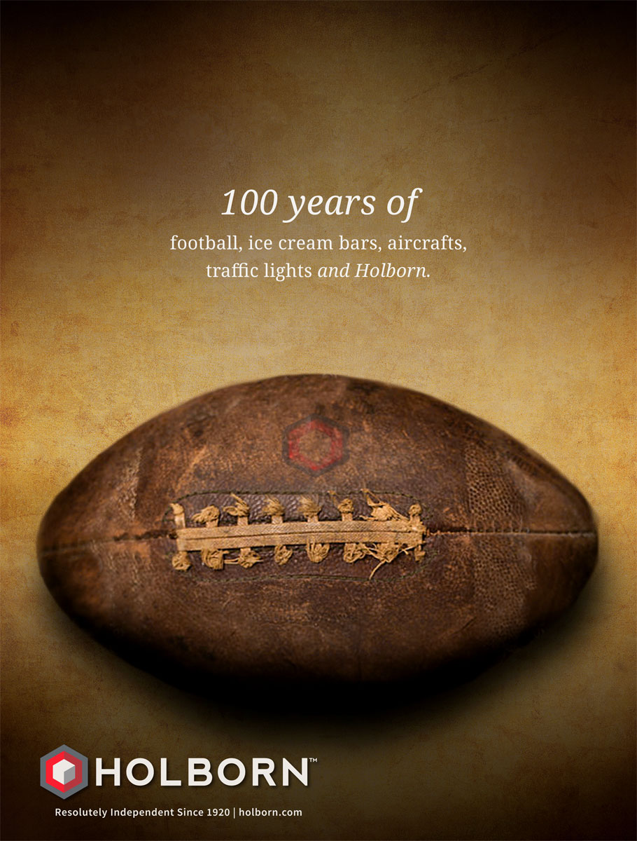
Even though digital is in our name, e9’s team has a strong background and vast experience in print design. Having worked with Holborn for many years, and despite slight changes to team members on both sides, there is still a very strong sense of familiarity. Print ad campaigns have been completed for Holborn since 2015, which is when the initial collaboration began. Originally having done a website redesign, rebranding, and brand standards guide (read more about that in our full case study here), the print ads followed suit and reflected the guidelines put in place. However, with 2020 being Holborn’s centennial, it was the perfect time to break the mold and celebrate their 100 years in business with something more unique, dynamic, and conceptually meaningful. We worked through multiple rounds of ideas (including football, ice cream, and airplanes) and had fun with some messaging. The football concept was one of our favorites internally as it so closely reflected the 100-year timeline and encompasses American traditions. Eventually however, we worked our way towards two concepts that ultimately were chosen for print.
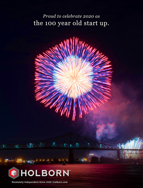
Bright idea.
The first was celebration! Certainly 100 years in business this day and age is quite a feat and one that should be celebrated with energy and flash. What better way to encompass those traits than with fireworks. Our team custom created a graphic by manipulating a beautiful firework display to mimic the shape of Holborn’s logo. Allowing that graphic to do the heavy lifting, the messaging and content was kept minimal and playful, communicating that Holborn has been around for 100 years, but is just getting started on the next. This succinctly signifies both a milestone and a starting line, while strategically using the less is more philosophy to display the confidence that an established brand like Holborn has rightfully earned.
Putting pen to paper.
With the use of a strong singular visual, minimal text, and lower logo placement in place, the next ad in the campaign series shared this template in order to create cohesiveness. However, for this one – the key concept was legacy. For any business to navigate its way through a century there must be solid principles in place that transcend the adaptation to new technologies. Holborn has thrived by being trusted by their clients, so to communicate the impressive span of time they’ve been in business while also highlighting their long-standing client relationships – we paired an image of a fountain pen with short, clever copy. This sends the message that while the way we communicate has changed drastically over the years, for Holborn, it’s only changed in ways of the medium, not in substance.

Onward and upward.
The two ads, having received positive feedback, have been adapted for publications, as well as being converted into web banners and a digital cube ad. We thank Holborn for the opportunity to continue our collaboration, congratulate them on 100 years, and wish them 100’s more. holborn.com
WE’VE BEEN BUSY
check out these other recent projects
