When you meet people, do you say “I cut corners” or “I don’t really care to look my best” or “I might not look professional, but I actually am?”
Of course not.
The other day I was talking to a lawyer who was impeccably dressed in a fancy suit and seemed very well-spoken. I was thinking that I would hire him if I ever needed help in one of the areas he specialized in.
When I got back to my office, I took a look at his website…and was really disappointed.
It looked like it was done by a high schooler (maybe it was). Even worse, it looked like it was done by an untalented high schooler. The design was poor and the content was riddled with typos.
He will never get any business from someone who arrives via Google, or someone who gets there because he handed them his business card.
And I can tell you that he will never get my business because he showed me what his “brand” was truly about.
I know. I know…
You’re thinking: “Conrad, you met him. He showed you that he was knowledgeable. Are you really not going to work with him because of a poor website?”
Well, no.
I won’t work with him because I’ve learned that the way you present yourself gives me subtle clues about how you run your business.
A crappy website with typos tells me all I need to know about this lawyer’s brand. If he’s going to cut corners with his most important marketing piece, that makes me think that he’s going to cut corners when it comes to my case.
Remember, more people could see your website than actually meet you in person.
Think about the image you’re projecting, how people will perceive your brand, and all that business you’re probably losing because you look half-assed.
Here are some 2026 logo and branding trends to follow to ensure your website doesn’t look like it was designed by an amateur.
1. Clarity First So Logos Read on Mobile
Here’s the hard truth: your logo does not meet people within the loving bubble of your coworkers (although those are good to have). It meets them in the wild. On a phone. In bad lighting. Between a Slack alert and somebody’s foodie photo. You have at most six seconds to grab their attention—that means clarity has to come first.
A logo that looks gorgeous on a conference room screen but turns into alphabet soup at 220 pixels is basically a sports car with square wheels. Technically impressive, practically ridiculous.
The brands winning right now are designing for the smallest use case first. Our team starts with:
- Tight mobile widths: Logo versions designed to stay clear and readable in narrow spaces, like a mobile header.
- Favicon scales: Ultra-simplified logo marks that still work at tiny browser tab or app icon sizes.
- App-like surfaces: Digital spaces such as apps, social profiles, and mobile interfaces where logos need to be instantly recognizable.
That forces discipline. Cleaner silhouettes, stronger word shapes, and contrast that can survive glare all matter because people identify visual patterns faster than tiny decorative details. When the full logo gets cramped, a monogram or icon usually does the heavy lifting better.
e9 Perspective:
Brand recognition lives or dies in those little moments, and your logo needs to show up ready to work, not ask for reading glasses.
2. Textured, Imperfect Visuals to Drive Nostalgia
There is a reason texture is coming back. For years, brands chased the cleanest possible look, trimming away anything that felt messy, irregular, or human. The result was a sea of identities that looked polished, sure, but also a little bloodless. When every brand looks the same, people stop noticing the differences.
Grain, collage, rough edges, vintage treatments, and analog-feeling details bring warmth back into the room. They create friction in the best way. Like vinyl crackle or a handwritten note, texture reminds people there is life in the thing.
That emotional layer matters because connection and trust travel together. Consumers are more likely to trust brands they feel connected to, and alignment with brand values help create that connection.
Visual identity plays a real role there. Nostalgic cues can make a brand feel familiar, and controlled imperfection can make it feel honest.
This is why textured systems are spreading far beyond artsy brands. Even mainstream companies are using organic shapes, stamp-like marks, and tactile details to create authenticity in overly polished digital spaces.
e9 Perspective:
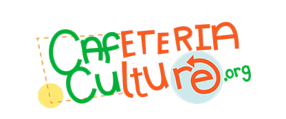
That’s exactly what our client CafCu did. They designed a logo mark with calculated imperfection, using bright colors and a unique hand-written font. Our website designer took inspiration from that nostalgia to design a website that flowed seamlessly with their existing brand.
3. Hand-Drawn Looks + “Signature Weird Detail” to Feel More Human
We’ve entered the age of polished sameness. AI platforms and modern trends have pushed content that feels overly perfect. And customers notice—60% of consumers avoid brands with unappealing logos.
That is exactly why hand-drawn touches, imperfect lines, and a little genuine weirdness are landing so well.
Take a look at our e9digital logo: with the “e9” working as mirror images of each other, it gives it a taste of unusualness that helps everyone remember us (and proves there is a human somewhere in the building).
This does not mean turning your identity into arts and crafts hour. The smarter move is controlled imperfection. Keep the mark simple, then add one memorable twist that gives it a pulse.
A few ways this shows up:
- Sketch-like mascots or symbols
- Collage-style typography
- Uneven or hand-shaped line work
- A single unexpected detail inside an otherwise minimal mark
e9 Perspective:
A combination of restraint and personality helps brands feel warmer, more ownable, and a lot less like they were generated by committee or software.
4. Logo Kits to Optimize for Every Channel
A single logo file is old-world thinking. That’s like bringing one pair of shoes for a beach wedding, a board meeting, and a hike, then acting surprised when your feet hate you. Brands need:
- Stacked versions: logo layouts arranged vertically, often with the icon above the name, for tighter or more square spaces.
- Horizontal lockups: wider logo layouts that place the icon and wordmark side by side for headers or website navigation.
- Icon-only marks: simplified graphic symbols used without the full brand name when space is limited.
- Social avatars: profile-ready logo versions sized and cropped to work clearly on social media platforms.
- Favicons: tiny browser or tab icons that distill the brand down to its most recognizable visual element.
These all need to work together like a system, not distant cousins who only see each other on holidays.
e9 Perspective:
Responsive logo design has moved from nice-to-have into basic survival. The strongest systems adapt by shedding detail at smaller sizes and bringing back personality when space opens up. That way recognition stays intact everywhere your brand is.
5. Chunky Statement Serifs to Carry Personality
After years of safe, polite sans-serifs marching across the internet like a corporate khaki parade, type is getting its personality back. A strong wordmark can carry more brand character than a forgettable icon ever will. Chunky serifs, tapered strokes, heritage-inspired forms, and expressive letter shapes are showing up because they create instant distinction. They have a voice. They sound like somebody, which is more than you can say for a lot of lookalike sans marks floating around right now.
What makes this trend interesting is that it gives brands a way to stand out without adding extra clutter. The typography becomes the logo and the attitude. When the letterforms are doing real work, you do not always need a symbol riding shotgun.
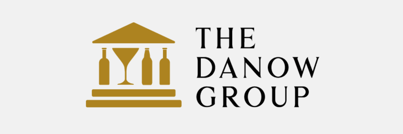
We followed these best practices when creating the logo for The Danow Group:
- Bold contrast in stroke weight
- Distinctive serifs with shape and tension
- Custom spacing that creates a recognizable rhythm
- Subtle historical references with a modern finish
e9 Perspective:
Think of it like a great blazer. If the cut is right, you do not need twelve accessories trying to save the outfit.
6. Flexible Color & Motion to Match Seasonal & Campaign Shifts
Rigid color rules used to be treated like sacred text. A strict 2 to 3-color palette made more sense when a brand mostly showed up in print, signage, and a desktop website. Now brands need something more useful depending on the background or style of medium. It has to work across light mode, dark mode, social posts, apps, campaign landing pages, motion, and seasonal creative.
A flexible system gives you room to:
- Shift seasonally without confusing people
- Support campaigns and sub-brands
- Create stronger contrast in digital environments
- Bring motion and mood into the identity system
That flexibility matters more in motion-first environments where identity shows up in feeds, video, UI states, and short-lived campaigns. A brand can stay recognizable while changing color, composition, or energy depending on the context.
e9 Perspective:
We leaned into that thinking in e9digital’s recent redesign by building a black-and-white foundation with strategic pops of yellow. It keeps the brand sharp, modern, and highly adaptable.
Stop Looking Average. Let e9digital Build a Brand Worth Remembering
When you’re the best at what you do, you should look like it.
That’s where I come in. At e9digital, we build logos and brand systems that hold up on small screens, across campaigns, inside motion, and under real-world pressure.
Here’s what you get with our logo and branding services:
- Strategic brand positioning
- Logo systems built for every channel
- Visual identities with flexibility and staying power
- Design that helps people remember you and trust you faster
I’ll make you look great, and I’ll make sure you get the business you deserve.