OUR WORK
e9digital

The myth behind the logo
In 2008, founder/CEO Conrad Strabone had secured business and was set to launch his digital agency. Just one problem. No name, until…inspiration struck. After a few celebratory glasses of wine, e9 came to him in a dream. Not just the name, but a logo design that embodied balance through the repetition of shapes.
The Birth of Our Mark
adaptable
Adaptable and versatile design for current and future branding.

Nod to the past
The first letter of Conrad’s previous company, Enzyme Digital.
Finding balance
Forms a palindrome—reading the same way backward and forwards.
2011 Refresh
NY ‘tude
Graffiti style with a spray paint finish captures the disruptive NY ‘tude of the times.
grassroots
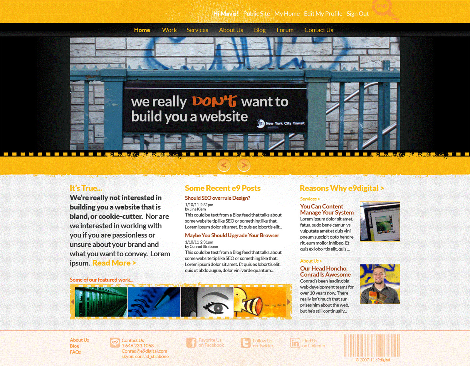
Local Imagery
Adds realness and captures that classic NYC grit.
Messaging
Introducing the new branding and website with a nod to the past.
Distressed Textures
Frames up imagery while evoking a noir, grainy film style.
2012 Refresh
minimalistic
Keeping on point with Apple-minimalistic design trends, e9 entered the clean phase.
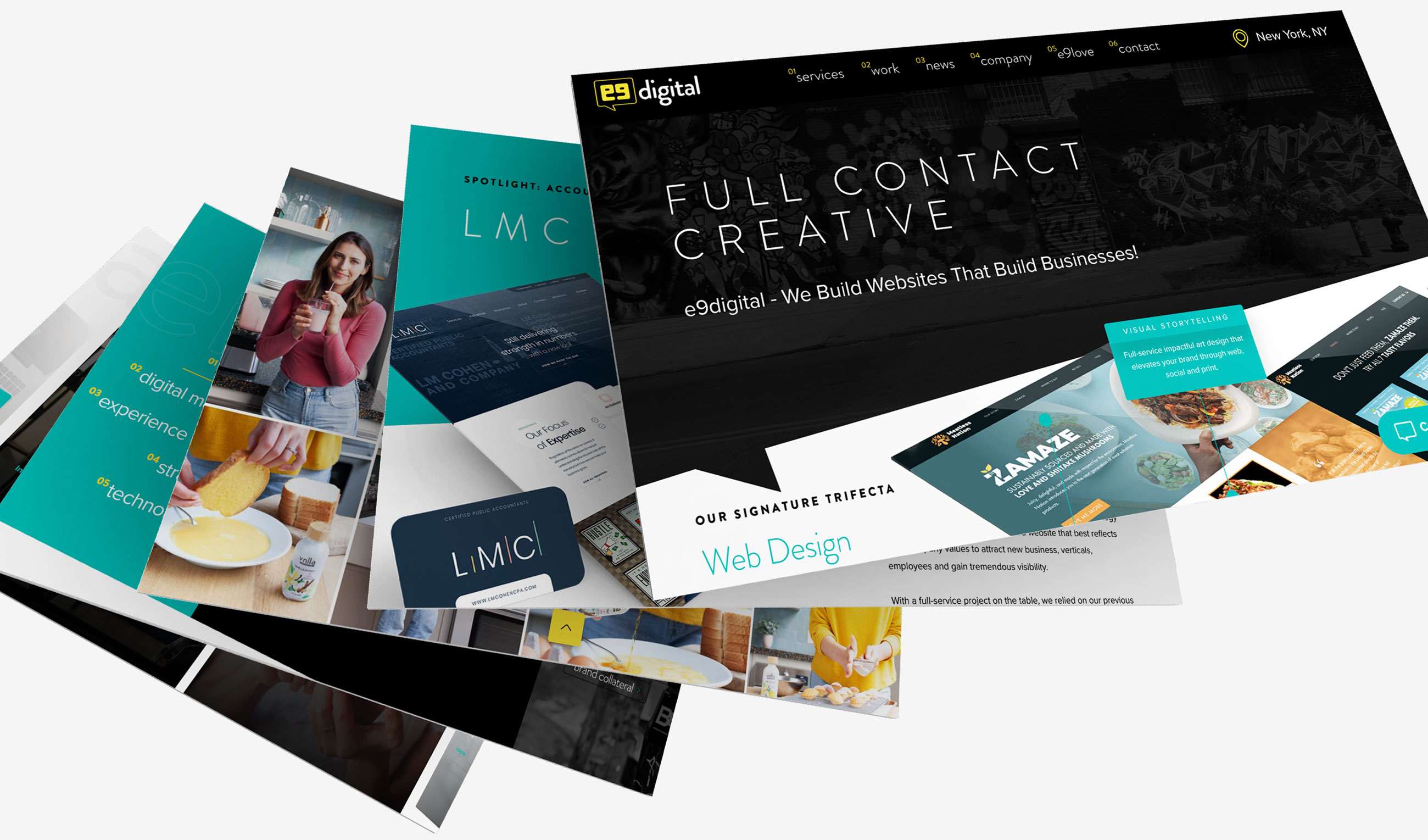
2020 refresh
insightful
As digital storytellers, we start with a conversation about your brand and vision. "Let's talk" is more than a mantra, so we animated it into our logo.
Elevating standards, pushing the creative limits
productive
With the advancement of the e9 visual identity, we were able to introduce bold new colors to our established color palette.
always evolving. never forgetting.
timeless
“The best visual moniker is one that changes with the times, but never loses its essence.”
(in a good way)Conrad Strabone, Managing Partner | President
notable news